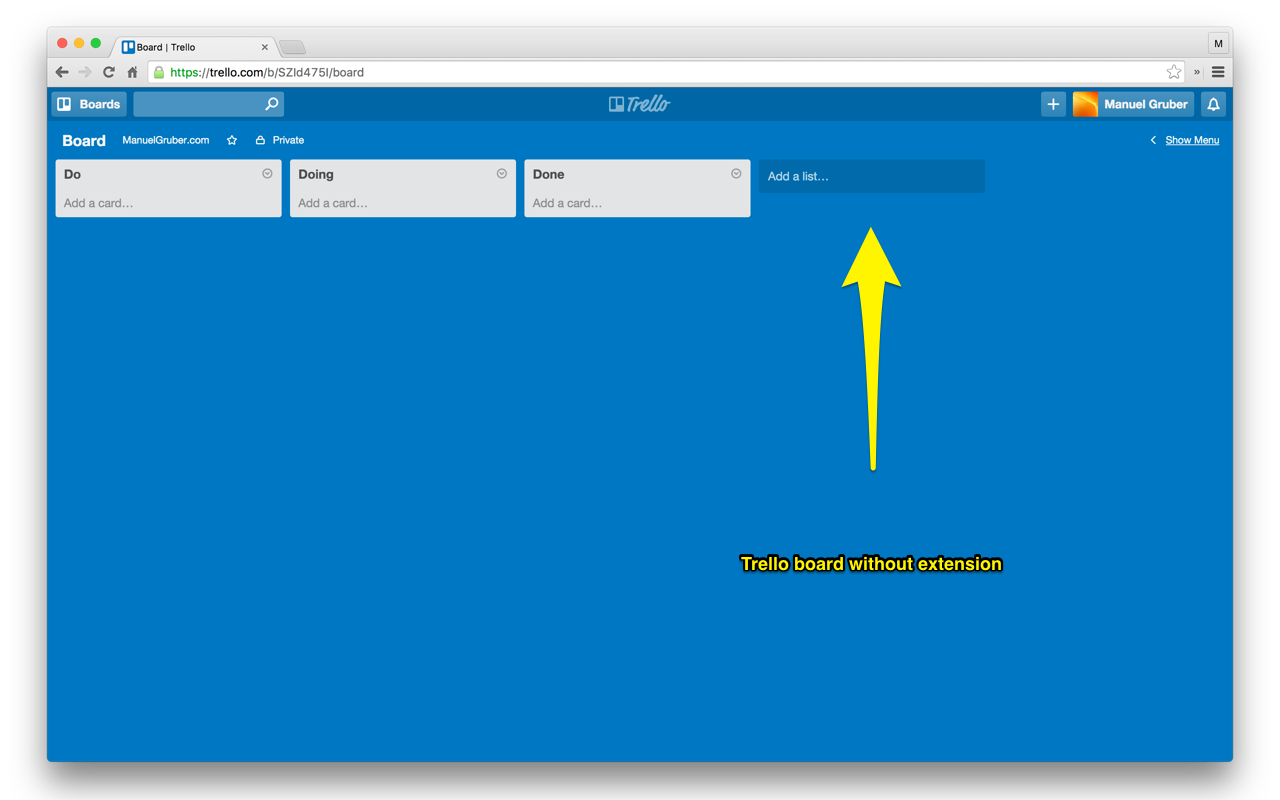
I’m using Trello.com frequently. It’s easy to use and an amazing tool. But the Trello team changed the board layout. They added another column on the right side of every board. As it’s a great idea to onboard new users, for existing users it’s disturbing. The “Add a list…” button wastes space on the screen. Especially for boards with a few columns / lists, the additional button will add a horizontal scroll bar. And so the my Trello user experience suffers.
Hide the button
So I created a tiny Chrome extension to hide the “Add a list…” button. Here’s an example Trello board without the extension:

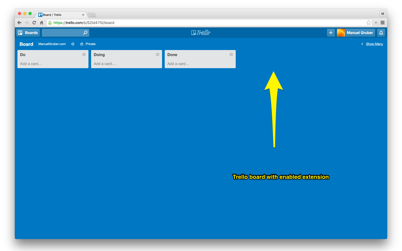
And here’s the Trello board with enabled extension:

The code of the Chrome extension is on Github. Basically it uses CSS to remove the button.
How to install the Chrome extension
This Chrome extension solves the problem:
- Install the extension from the Google Chrome Web Store
- Refresh all browser tabs with Trello boards
- The extension will hide the “Add a list…” button
- If you want to add new lists to your board, just go to the installed extensions ( chrome://extensions/ ). There you can disable and enable the extension.
The link to the extension on the Google Chrome Web Store is https://chrome.google.com/webstore/detail/trello-clean/iodgmlcdnnjgiejimnifloaaaehkbdno.